Department for Transport Circular Roads 3/93 Appendix B
APPENDIX B
RECOMMENDATIONS FOR THE DESIGN OF STREET NAME PLATES
- Because street name plates are commonly viewed from an angle it is important that wide well-spaced lettering should be used.
- Capital lettering should be used to avoid confusion with traffic signs, which generally employ lower case lettering.
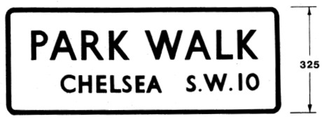
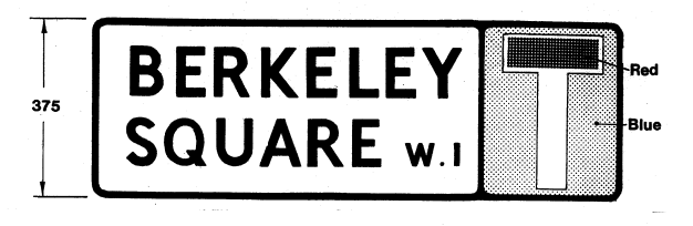
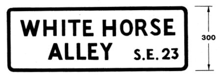
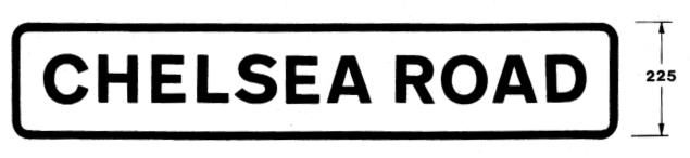
- Figures ( i ) – ( vi ) illustrate suggested alphabets and designs. It should be noted that the many serif alphabets do not perform well when used on reflectorised backgrounds. Authorities are recommended to employ “sans serif” lettering on reflectorised name plates. Figures ( iii ) and ( iv ) employ a "sans serif" Gill letter. Figure ( v ) – ( vi ) use the pre 1965 Revised Standard Transport Alphabet. Figure ( vii ) shows the Transport Heavy Alphabet which is in current use for black legends on traffic signs. The relationship of the stroke thickness to letter height is shown in brackets. (It should not be more than 1 : 7 and not less than 1 : 4, to ensure adequate legibility). Figure ( v ) illustrates a street name plate with a “No Though Road” sign (diagram 816.1) in Traffic Signs Regulations General Directions 1981 (same number in the 1994 TSRGD). This sign may be used with any street name plate to indicate a no through road to vehicular traffic.
- A 100mm actual capital letter height of lettering is the recommended standard for both the Standard Transport and Transport Heavy Alphabets. With other alphabets with broader letter forms, 90mm may be used to reduce the length of the plate. Where fixing space is very restricted the design shown in Figure ( vi ) with either the Standard Transport or Transport Heavy Alphabets at 75mm capital letter height is preferable to using a 100mm alphabet with compressed letters and spacing. A 150mm letter height may be more appropriate on fast main roads.
- Normally street name plates should have black lettering on a white background with a black border, as this gives the best contrast. Where coloured legends or backgrounds are used, a contrast ratio of at least 7 : 1 is required. The use of colour combinations with low contrast, for example bronze or brown lettering on green backgrounds, will result in poor legibility, especially under low pressure sodium street lighting. The white background should be reflectorised wherever plates are likely to be viewed from vehicle headlamps.
- Only well known abbreviations should be used e.g. Ave., Cres., St., etc.
- When streets have been re-named, the old name crossed out but clearly legible should remain for at least 1-2 years and then removed.
- Only durable materials should be used for the construction of name plates and they should be maintained in a clean condition. Where a name plate is mounted on a specially provide post care should be taken to ensure that the appearance of the post and the back of the plate are as pleasing and as unobtrusive as possible. Aircraft grey No. 693 to BS 381c has been found an unobtrusive colour in most environments when erecting traffic signs and can be applied to street name posts. Black may also be used if preferred.
- Area colour coding by a background colour on the street name plate is not recommended. There is a loss of good contrast with many colour combinations. A coloured border may be a suitable alternative. Good contrast (a ratio of at least 7 : 1) is necessary if this is to be effective.
- The chief aim of letter spacing is to give good legibility having regard to the letter form used. Spacing should be sufficient to prevent letters having a jumbled appearance when viewed from an oblique angle. The apparent area between successive letters should be as uniform as possible and this is affected by the shape of individual letters. Vertical strokes found in B, D, E, etc are those which need to be furtherst apart; curves in B, C, D, G, etc permit a slight decrease in spacing; right angled letters E, F, L, etc and slopping ones, A, K, V, etc can be closer still; some combinations such as LT, LY and VA can almost overlap.
- The minimum spacing between words should be some 40% - 50% of the letter height, dependent on the form of the terminal letters. The end spaces to the border should not be less than would apply if the border were the vertical stroke of an adjacent word, except that some reduction in end spaces may be satisfactory if the line consists of a single word or is the longest line of several. Top and bottom borders should not be less than 50% of the letter height, and spacing between the lines not less than 40% of the letter height.
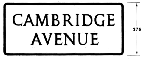
- If district names are included on the name plate they should be shown in a smaller or reduced height of lettering. Figure ( iv ) gives an example.
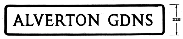
Fig. I Kindersley - 90
Fig. II Kindersley - 90
Fig. III Gill (1/7) - 90 & 50
Fig. IV Gill (1/7) - 90 & 50
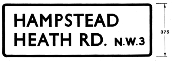
Fig. V Pre-1965 Revised Standard (1/6) - 100 & 50
Fig. VI Pre-1965 Revised Standard (1/6) - 75 & 50
Fig. VII Transport Heavy (1/5.2) - 105 (related to 75 x-height)
all dimensions in millimetres